Going Unseen? Build Your Art Brand Like an Altar
It was desperation that ultimately led me to delete Threads. Not my own, but that of others, understandable but cloying, pressing through the screen. When you listen to one person’s discouragement, you feel empowered to help. There’s something to be done there: a conversation to be had, support to give. But my Threads feed had become a fountain of misery.
Because of the algorithm, the more disgruntled posts I tried to shine some perspective on, the more I saw. Lament after lament filled my screen: “no one’s seeing my art, no one’s buying my art, no one likes my art,” and beneath all that, the unspoken, piercing fear, “no one sees me.”
The helplessness, once familiar, made me ache.
When we approach visibility with near-religious fervour, the rush of putting something out there is quickly smothered by an audience’s cold indifference. It becomes a prayer that goes unanswered.
I would know, I’ve worshiped at that altar.
While the desire for your work to be acknowledged is perfectly natural, none of us are entitled to the attention of others. If you want to stand out, your work needs to be compelling. But once the work is developed, there’s another essential step to take care of: your artist’s brand.
In this day and age, your brand is the final key to getting seen.
Keywords: The Spirit of an Artist’s Brand
When you're a creative, the concept of a brand can feel at once esoteric and clinical. We’re used to associating brands with corporations, but as an artist, you have a personal brand too. This is an accumulation of what people come to feel, expect and associate with your work.
Your brand includes the art itself, yes, but also your website copy, your chosen fonts, your photography, your social media posts, and much more. I would go so far as to say that even your workspace can become a brand asset if you share it publicly. Every visible choice you make contributes to the overall impression viewers have of your artistic world.
This is where many artists’ skin starts to crawl.
Most of us hate being boxed in, and it’s easy to mistake intentionality for artifice. But I propose framing it differently: your art is never in service to the brand; your brand is in service to the art. You don’t force your work to conform to the fonts or photography style you’ve established,that would be suffocating. As your art evolves, your brand naturally shifts alongside it.
However, by the time your work is developed enough for you to be thinking about visibility at all, there’s probably already a throughline present. The brand is built around that continuous thread that ties your entire body of work together.
I’ll use myself as an example. Regardless of the varying palettes I’ve featured in my paintings or how dark or brightly lit a scene is lit, there’s a feeling of having stumbled upon something you weren’t meant to see. Or if you were, it’s because the subject let you. The landscape is verdant, the ambiance fantastical.
The keywords “lush, clandestine and mythic” therefore always apply to my work.
To find your keywords, begin by making lists of the colours, textures, or subject matter that repeatedly appear in your work. Then, see if there are larger overarching words that encompass those elements.
For example, my paintings might include: deep green, flowers, ferns, etc. The proliferation of those elements in most paintings is how I landed on “lush,” because it evokes that sense of natural bounty.
Take some time and ask yourself: what are those words for you?
The Law of Correspondence: Branding Like a Witch
For those of us who are metaphysically inclined, branding can be a deeply intuitive process. If you understand witchcraft, you already understand branding, and if you’ve ever built an effective altar, you can create an at least serviceable brand for your art.
Both branding and altar building rely on the law of correspondence: the belief that what is made manifest in the physical world reflects something deeper and unseen.
An altar is a physical space where Spirit can come through, a microcosm of the universe that you can align with your intentions. Your brand, like an altar, becomes a channel through which your work’s essence is deliberately represented and engaged with.
When discussing the law of correspondence, practitioners will often reference the Emerald Tablet, a legendary alchemical text. From the tablet comes the famous saying: As above so below, as within so without.
In other words, the microcosm and macrocosm reflect each other. This includes the heavens and earth, as well as the inner and outer world. Some would even say they’re one and the same.
In magic, a “correspondence” is a physical item that represents a metaphysical concept. On an altar, a green candle might correspond to money, because we correlate the colour green with a time when the trees are ripe with fruit. Green is symbolic of abundance. And in that instance, the spirit of abundance is what we're trying to manifest, by way of cash.
For magical creatives, the law of correspondence can become an unusual and effective framework for branding. Its subtlety can give us an edge over peers approaching branding from a strictly heady or mundane perspective.
Manifesting the Spirit of your Brand
If branding is the physical manifestation of our body of work’s spirit, then the law of correspondence gives us everything we need to get started, and we can begin with our key words.
Look at your words and ask yourself: what colours, textures, and shapes do I associate with these? What would their correspondences be?
Once you have them written down, begin culling.
An altar is like a poem—you don’t want any extra elements. Every one must be intentional. If I were to leave my keys haphazardly on my altar rather than where they belong, the sanctity of the space would be called into question. The same would occur if I stored a pretty vase there, simply because it’s pretty.
If the objects on the altar don’t correspond to a greater intention, it becomes just another surface gathering clutter. The same is true of our brand. We must be exacting if we are to be seen as intended.
Let’s use my very first website’s palette as a case study for brand as altar:
I first commissioned a site in the summer of 2021. At the time, I had many of the same likes and dislikes as I do now, but a more naive understanding of visual communication. Red was my favourite colour, so my site featured burgundy accents.
I kept that site active well into 2025, by which point my understanding and actual art had evolved significantly. When redoing the site myself, I scrapped all the original colours.
Why? Let’s look back to my keywords: lush, clandestine, mythic.
Red is a bold colour. It immediately grabs attention, even in less saturated hues, like burgundy. That directly clashes with the idea of the brand being clandestine. You wouldn’t use red in a spell for secrecy, because it corresponds to fire. It’s lively, commanding.
Likewise, as a creative, you can’t have a palette that shouts if your brand is meant to whisper.
In burgundy’s place I now have a dark, desaturated purple. Purple is a rare enough pigment that it adds an air of mythos, but the exact hue I’ve chosen still feels grounded. From a colour magic perspective, purple corresponds to spirituality and the third eye, which reflects my ethos as an artist.
The colour palette of course is just one manifestation of this approach to branding. When we gaze through this metaphorical looking glass at all our brand elements we can see more clearly what is welcome and what can be let go.
As people who work with our hands, it can feel more intuitive to play with correspondence within our studios, than to immediately jump to finalizing slightly more “abstract” design concepts, like your fonts.
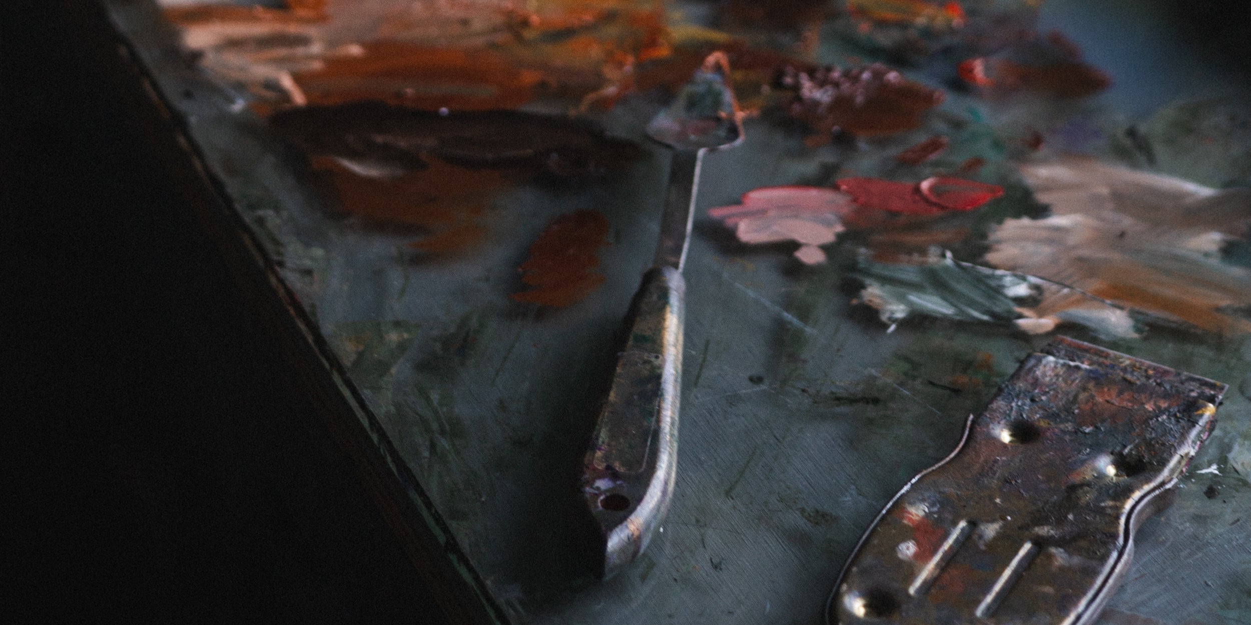
A particularly clarifying branding practice is considering your studio as a living altar, especially if it’s visible to your audience. How can you make your physical space a manifestation of your work? How would it feel to place every object with intention, for every vignette to represent something deeper?
You know you’re on the right track when your intentional workspace (whether that’s the surface of a desk or an entire room) and your other branding elements begin to align.
This degree of intentionality is crucial if you want the metaphysical, and literal infrastructure of your brand to hold up over time.
Seeing Yourself First
If we’re to follow the law of correspondence, then it becomes clear that your inner world has the power to influence your external circumstances. Visibility, then, starts with you.
Looking ourselves in the eye can be discomforting but it’s worth the scrutiny. The time and attention you give your inner world and your brand as an artist amplifies its resonance toward others. You may be tempted to do so in an overly-critical capacity; many of us have that instinct when brand-building.
Resist the temptation.
Instead of fixating on what you and your work are not, look to—and celebrate—what you are. It’s only once you acknowledge your unique value that you’ll be able to communicate it to others. From that position of power, you know it’s not a matter of if you’ll be acknowledged, but when. The rest can be improved upon later.